I imagined Portra over a lack of larger platforms for analogue photography. Since I have a great interest in film photography, I follow a lot of amazing photographers on social media. However, I've always loved the combination of physical artefacts and digital platforms for inspiration, like magazines such as Vogue and The Gentlewoman, both existing online and offline.


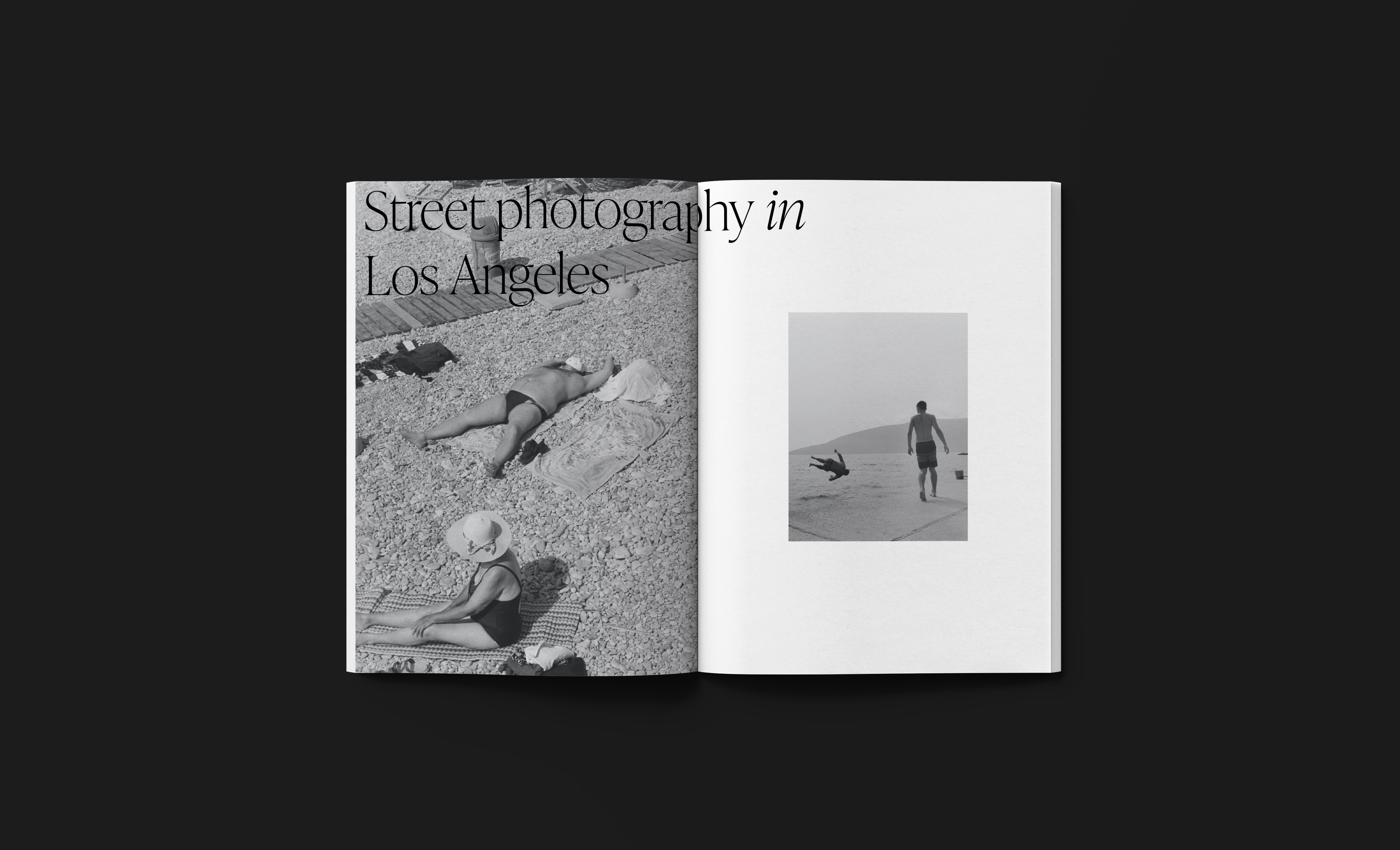
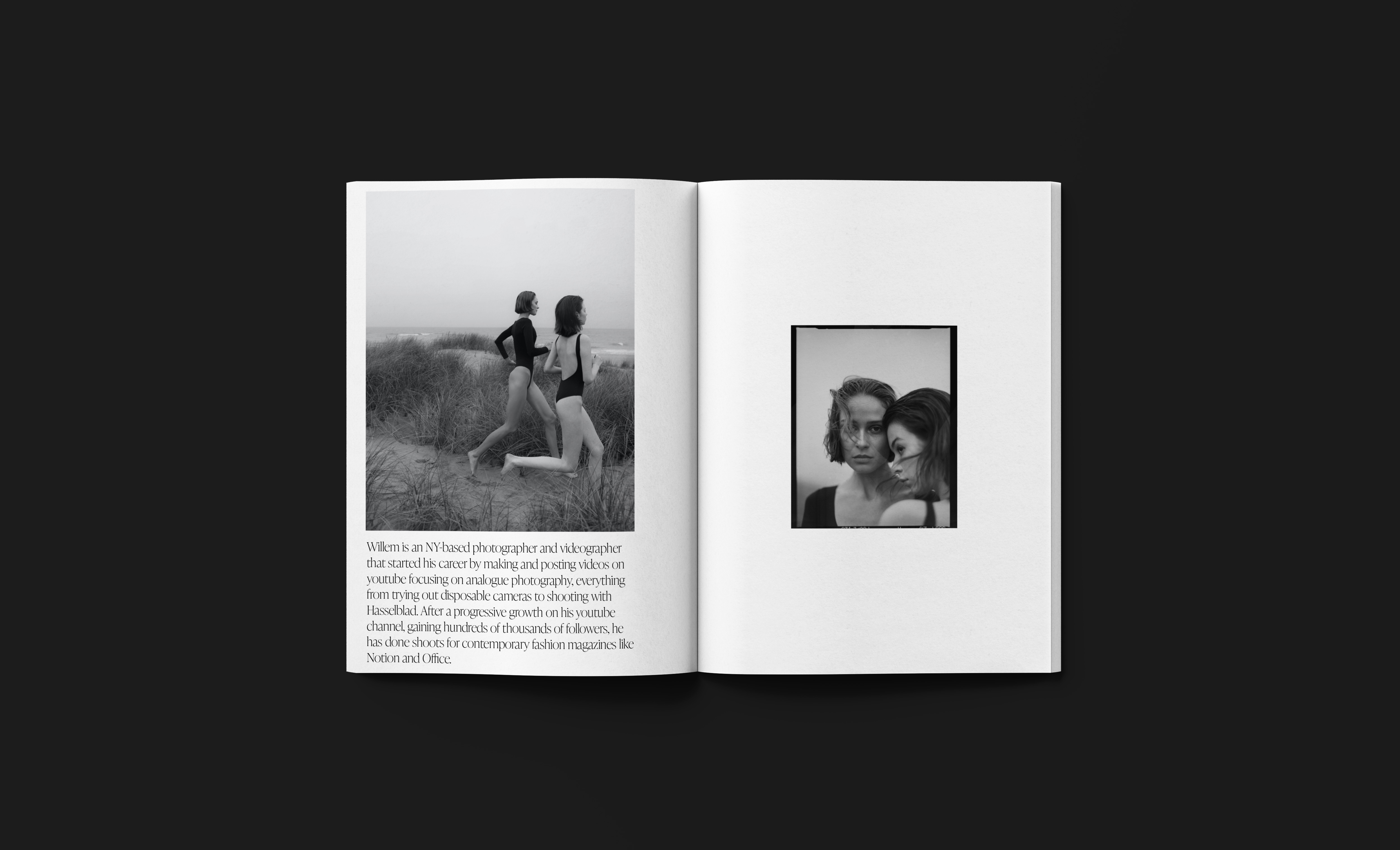
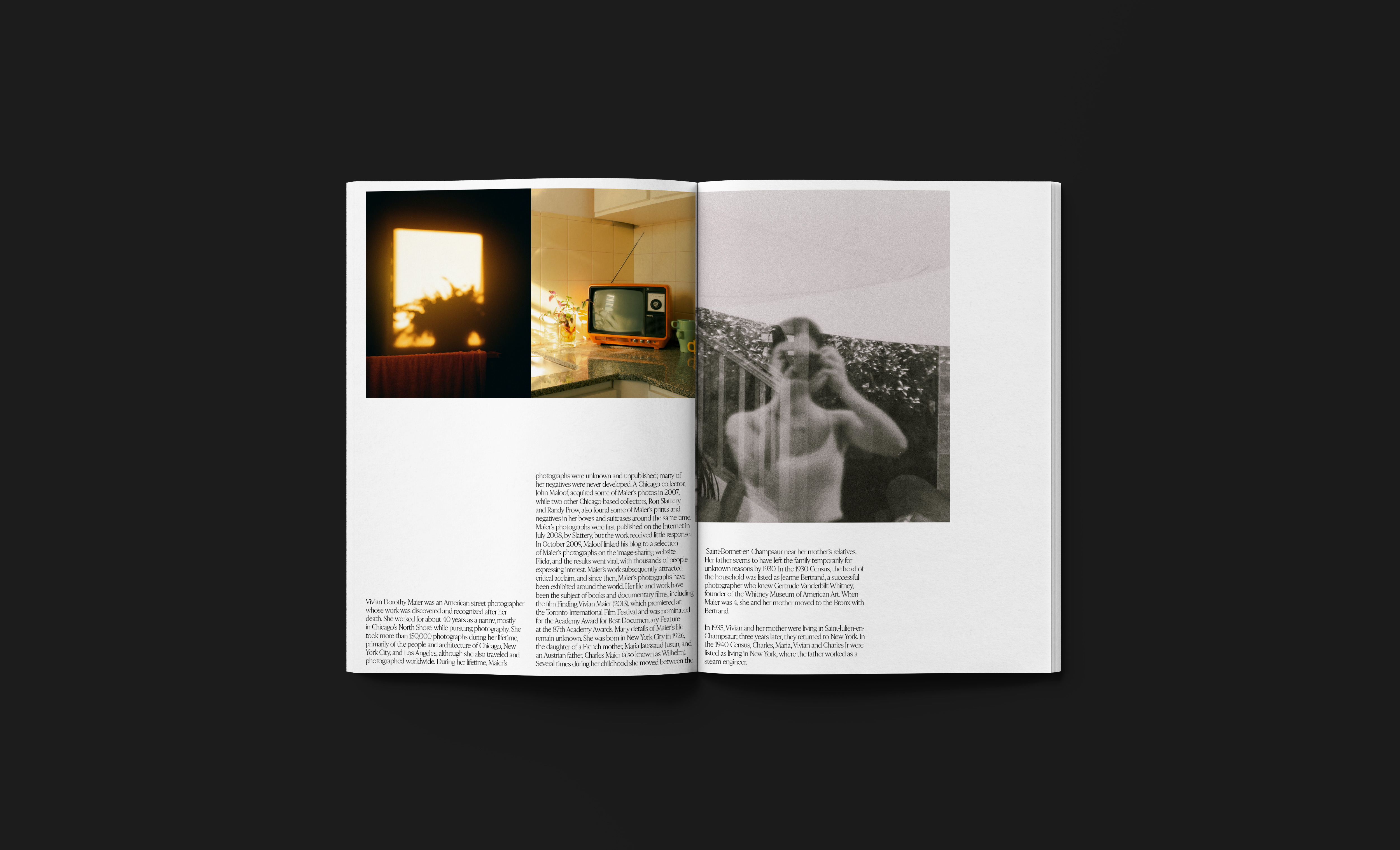
In the magazine, the font IvyPresto Display is used both as header and body font. The thought behind the choice is to keep the design as smooth and sleek as possible to let the images talk and stand out. I searched for a serif font, which weight and sophistication would contrast the more urban and artsy feel of film photography, and found IvyPresto Display. 


For the layout, I took inspiration from the negatives of a film roll and the size difference from looking at a negative to the finished result. I wanted the images to take space but also breathe. This is also why I worked a lot with white space.


Work: Creative Direction, Layout Design
Year: 2021
Details: Instagram, Photoshop, Unsplash, Pexels


11:50:37
Monday Nov 5 2018